Graphics matter. As television fragments and mobile screens become as important as living room sets, 69% of consumers now watch video without sound in public places. Graphic content needs to work harder than ever to convey the story as a result. And with audience attention and advertising revenue now split across different platforms, getting those graphics right is more important than ever.
This is becoming increasingly difficult. We’ve all seen poor quality pictures on LinkedIn or Facebook — a blurry torso, a cut-off headshot — where the resolution is all wrong for the target platform. Broadcasters face that problem x 10. One viewer can be watching a program on a giant OLED screen while another watches the same content on a smartphone on a train. Both demand the same high-quality audio-visual experience, and both also expect to be able to switch at will, to transition from one screen to another seamlessly.
Broadcasters, from linear to OTT, therefore, need to deliver graphics that work and are readable on any and all devices. Even more challenging, they need to do this while maintaining brand consistency across this new multiplicity of formats and without using additional in-house or outsourced resources. While graphics matter, so do budgets.
Why Adaptive Graphics™ is the answer
The solution is to take an Adaptive Storytelling approach, allowing user-generated rules-based automation to adapt content to target platforms without swallowing additional resources. Which is why with the launch of Viz Engine 5 we are introducing Adaptive Graphics™; single workflow-multi-platform content delivery that automatically adjusts resolution and format to support specific display devices and effectively enables graphic artists to create once and publish multiple times.
Producing broadcast graphics can be likened to a factory production line. In the current broadcast environment, broadcasters typically find themselves running several production lines in parallel. One serves linear, one serves social media, one is pointing at online, and so on; each producing content but with variations to accommodate different target outputs. There are several problems with this scenario. First, it wastes resources; artists end up repeating work when they could be moving on to other creative projects. Second, everything is multiplied from equipment cost to carbon footprint. Third, it encourages drift away from a consistent Corporate Identity, as individual users meet different challenges in their own workflows in a variety of ways.
With Adaptive Graphics™ everything is produced from a single production line and the final output is only locked in as the very last process. Everything up to then is fluid, editable, and — crucially — consistent.
By giving artists the tools to create flexible, adaptive content that automatically adjusts to pre-defined output formats on the fly, broadcasters can collapse multiple, parallel workflows into a single pipeline that automatically optimizes the content for the delivery platform.
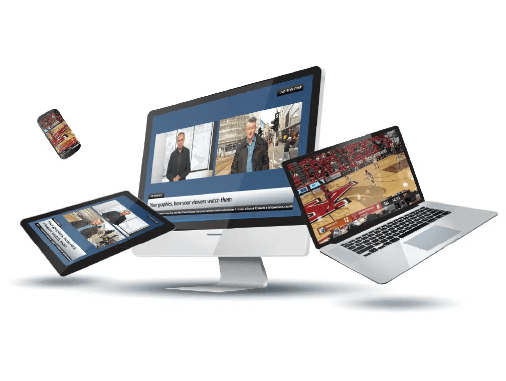
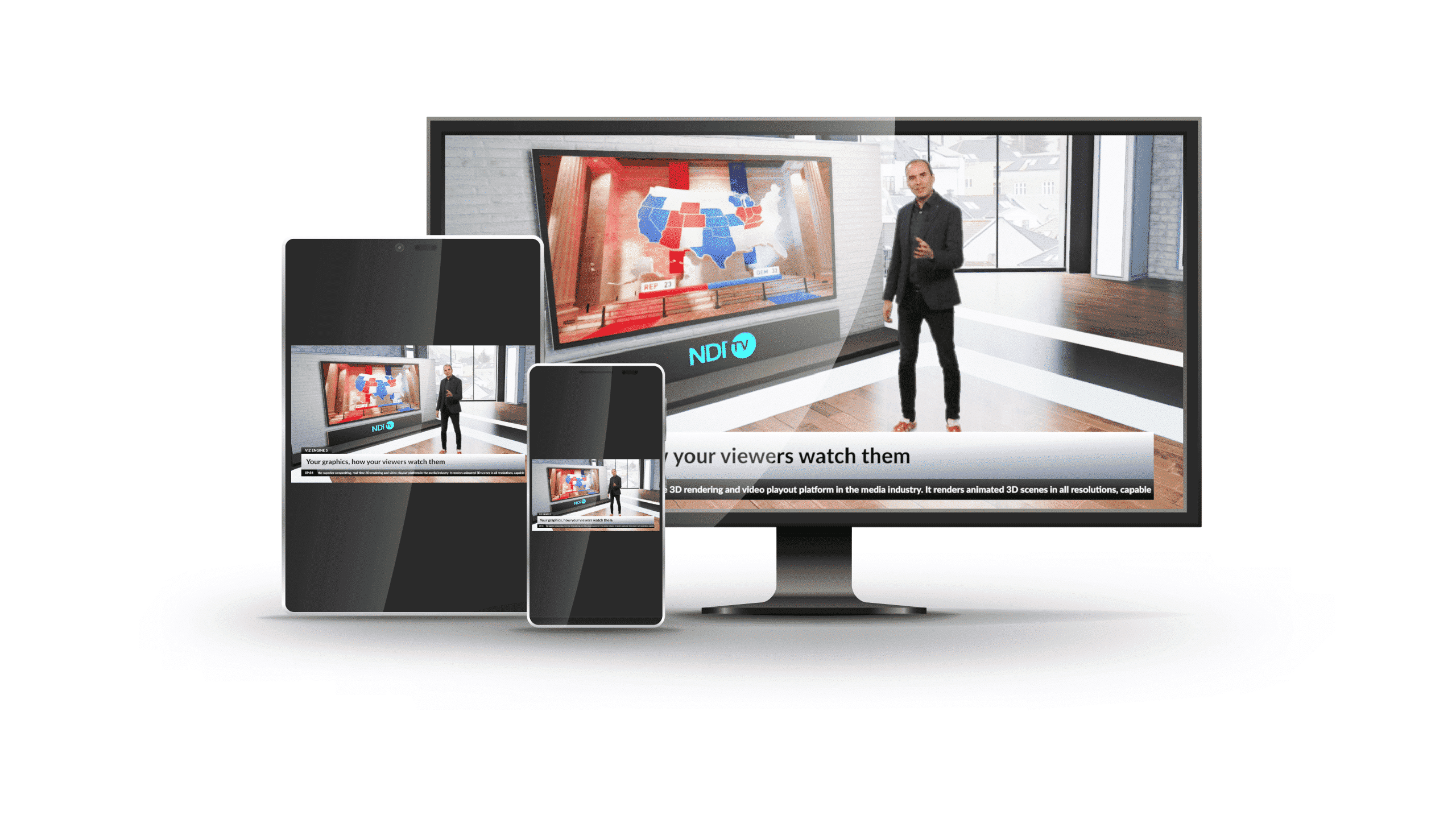
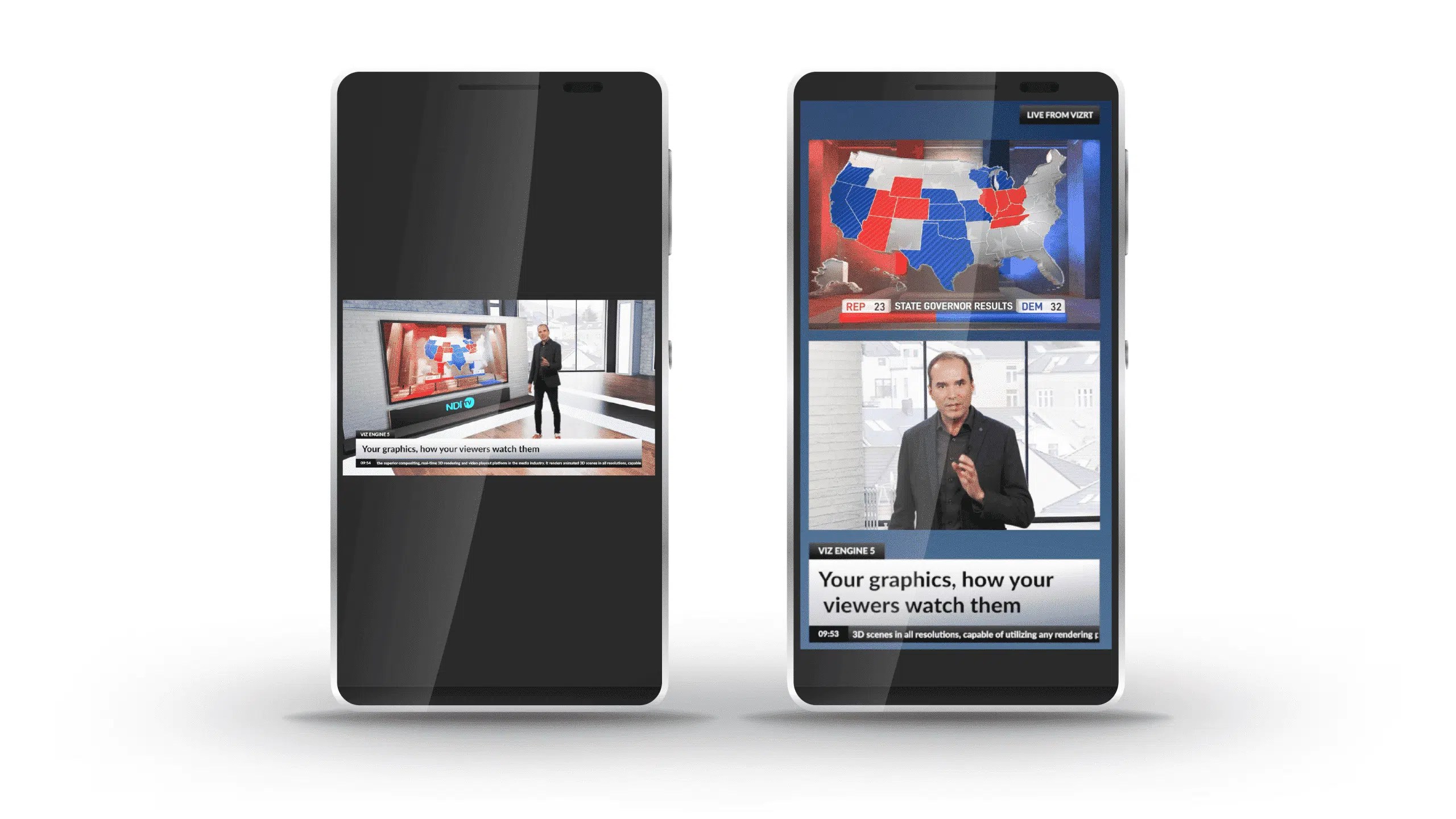
Adaptive Graphics™ in Viz Engine 5 means that graphics will render perfectly for every intended device – in the layout you choose and in the way that just works best. It does not matter whether your target platform is 16:9, portrait, landscape, square, or even the custom resolutions and aspect ratios of modern video walls, your content adapts each and every time.
So, how does it work?
In essence, we’ve added some new tools and capabilities to Viz Artist and Viz Engine that allow elements to be positioned relative in space; either relative to a given viewport, a given container volume or size, or to other objects. The same adaptability can also apply to their size or scaling factors. All this allows your graphic elements to effectively flow into the aspect ratio and screen size of the desired format.
In many ways, this is similar to the tools that web developers have had access to for years that allow them to create responsive websites accommodating a variety of target screen sizes. We have taken the concepts behind those and applied them to the production of high-quality broadcast graphics, giving graphic artists the assurance that their work will display as they intended on their target screens.
New features include:
Cost-effective consistency
More people are watching more content on more screens all the time. UK adults spend nearly a third of their waking hours watching TV and online video content, US residents spend an average of 323 minutes per week watching video content on their mobiles, and video apps account for over two thirds of all global mobile data usage.
For broadcasters, achieving both a consistency of brand and a consistency of information across that multiverse of screens is one of the key headaches they face. It is a task that consumes unnecessary resources and leads to pronounced inefficiencies in the workflow, not to mention an increased possibility of error when it comes to the broadcast. It doesn’t have to be that way.
Adaptive Graphics™ in Viz Engine 5 allows broadcasters to run a single graphics production line rather than multiple ones in parallel. It enables users to genuinely create once and then publish many times, using an easy-to-use new toolset that allows them complete control over how their graphics will look on everything from a mobile phone in stadia to a giant city center video wall. With Adaptive Graphics, consistency is guaranteed, flexiblity is innate, and enhanced fan engagement is inevitable.
To learn more about how Adaptive Graphics™ can revolutionize your multi-platform production, join us for an exclusive technical preview webinar on Adaptive Graphics™ in Viz Engine 5.